Simpson.edu Style Guide
A quick reference for color, typography, icons, and website components
Featured Text
Lorem ipsum dolor sit amet, consectetur adipiscing elit, sed do eiusmod tempor incididunt ut labore et dolore magna aliqua. Ut enim ad minim veniam, quis nostrud exercitation ullamco laboris nisi ut aliquip ex ea commodo consequat.
Color
The Simpson palette is designed to support a range of visual styles, using two primary colors, two accent colors, and four neutrals.
Primary Colors
Simpson College Red
#9f0129
Simpson College Gold
#f7af00
White
#ffffff
Accent Colors
Blue #204161
Bright Red #c52233
Neutrals
Dark Gray #1a1a1a
Gray #333333
Light Gray #e6e6e6
Off-White #f5f5f5
Typography
Typography is the core structure of any well-designed interface – used to create clear hierarchies and efficient organizations to guide users through their web experience. Simpson.edu uses three distinct type families.
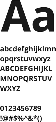
Open Sans
Open Sans is considered the primary font for Simpson.edu and is used for the majority of headlines and subheadings.
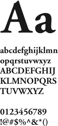
Garamond
Garamond is used primarily for body copy and eyebrows, but can also be used for headlines when a serif font is desired.
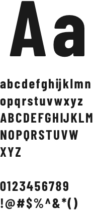
Barlow Condensed
Barlow is primarily used for CTA styling as well as some highly stylized headlines within components.
Iconography
Iconography consists of images and symbols used to visually represent an object or subject. Icons should be used sparingly, only to provide clarity and reduce cognitive load on users.
It is recommended to use icons from Font Awesome when needed.
Components
Simpson.edu has been built using flexible content blocks called components. These components can be used in various ways to create unique pages throughout the experience.
Below are examples of some of the most used components on the site. For the full listing of components and specifics on how to author, please download the authoring guide or contact Kenneth Ndzedzeni, website administrator.
This component is a content tout
It can have an introduction followed by multiple content tout sections. This component has variable background color.
Accordions are similar to tabs.
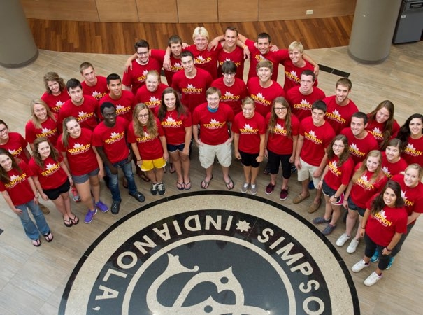
This is a 1 Column Image Tout
It should be used to breakup page layouts and provide a clear call to action for the user.
This is the Tab component. It is recommended to use 3 tab sections per component.
Quick Links Eyebrow
This is the Quick Links component
This component is an Icon Tout
Icon touts display key facts and figures about a topic
Stat
Description goes here. Over60%
Alumni who earn advanced degrees.2016
National champions of PiKappa Delta debate tournament.This is the Program Requirement Accordion
It is primarily used to showcase example courses for a particular major, but it can be used throughout the site in other ways.
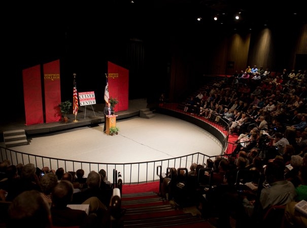
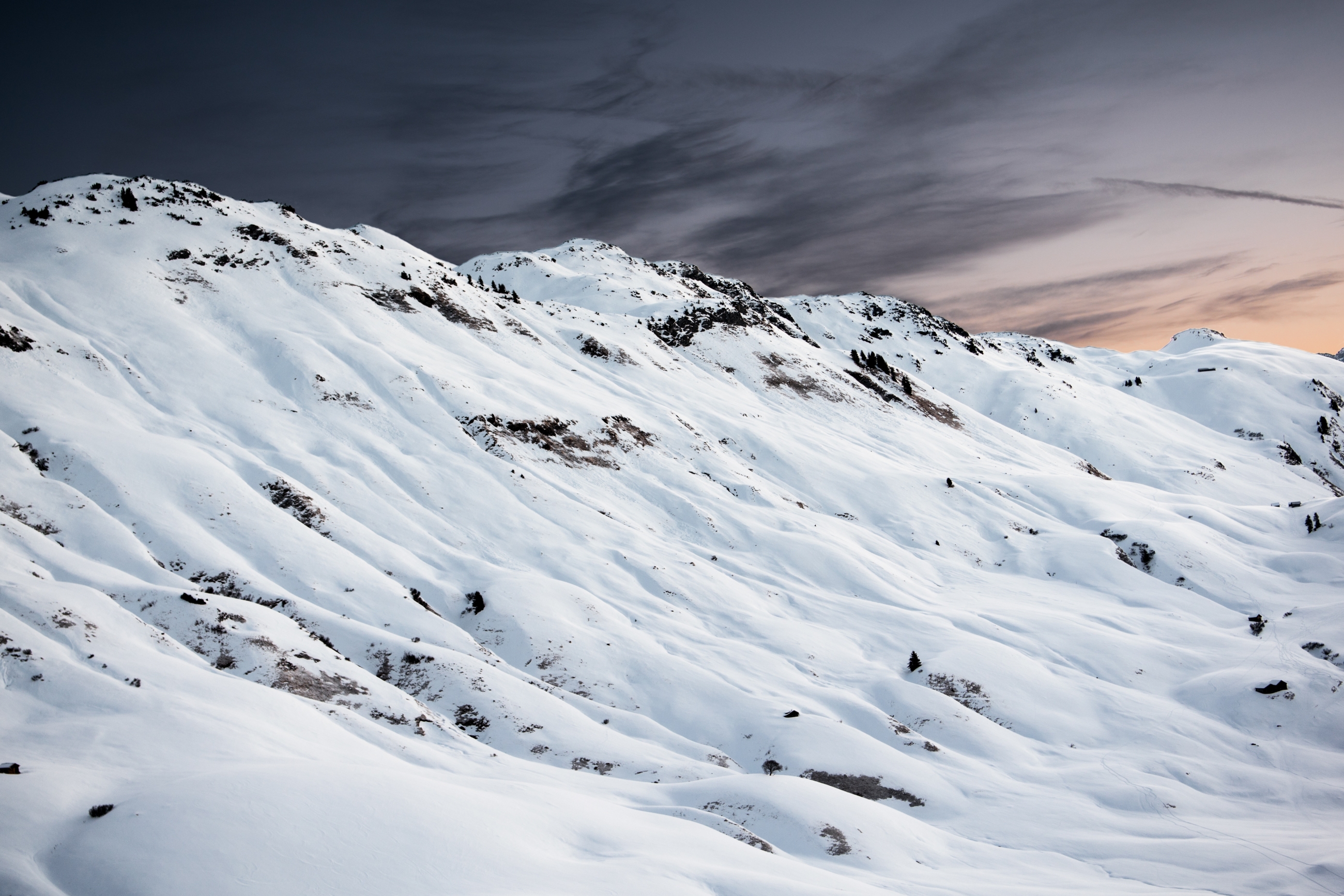
This is a Two Column Image Tout
It features an image alongside content. This helps to break up the layout of a page and guide the user.
You can choose whether the image goes to the right or the left of the content.
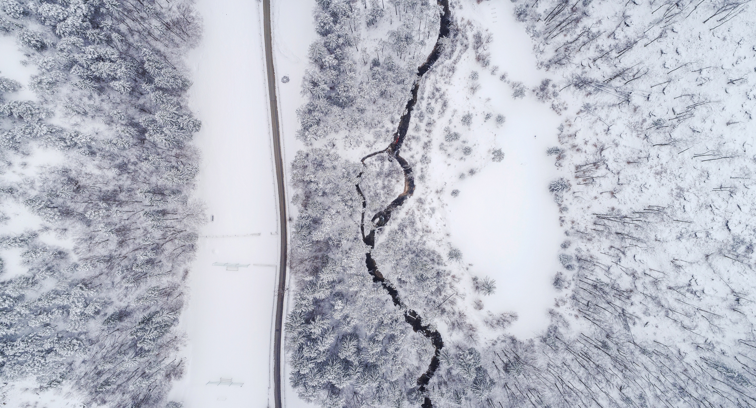
This is another Two Column Image Tout
But this time the image has been set to the right.

Heading Fonts
Below are all of the available heading fonts on Simpson.edu. The copy you are currently reading is considered "normal." Below are the different fonts and sizes that can call attention to specific pieces of content.
This is heading 1
This is the title of a post or story.
This is heading 2
This is used as a subheader that classifies the main idea of the paragraph and separate sections.
This is heading 3
A subsection that further clarifies the points of subheads.
This is heading 4
Usually used in formatting lists or bullet points.